How to compare 20 samples? - (Nov/04/2009 )
Hi all,
I have 20 samples and 4tests each. How can I present it in my paper? I tried the bar chart, but it seems that my samples are too many to be presented clearly.
I have found the attached chart but I donot know how to draw it.
any suggestion?
Many thanks in advance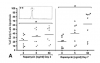
What program are you using?
lab rat on Nov 4 2009, 08:38 PM said:
hi
I use excel 2007 for my statistical works, but I donot know , by what program is this chart drawed
Do you need all 20 samples (though I'm not sure what you mean exactly with sample and tests) shown in your graph? Why not means or medians? Box-and-whisker plots are good and have lots of information that describe the data...
You could also try to show a relationship by a correlation or regression analysis...then you have a scatter-plot and a regression line showing the relation...
hobglobin on Nov 5 2009, 12:26 AM said:
You could also try to show a relationship by a correlation or regression analysis...then you have a scatter-plot and a regression line showing the relation...
dear hobglobin,
thanks for your reply.I have 20 patient samples and 4 treatments of a drug per each sample. therefore I need to show all samples as dots, just like the attached chart (in this chart there was 7 samples and 3 treatments). what is this type of chart called?I couldnot find it in the chart types of excel.
thanks for your suggestions
hi acute,
I think the graphs you are showing as an example have been made on PrismGraph which in my opinion is a great program.
To do this in excel (as far as I know) you need to "trick" the program a bit, but is doable. You need to draw a Scatter plot, basically an XY graph without lines. Plot your data in different columns by treatment, and each patient data in one row (for each corresponding column). Select all your data and insert Scatter plot, the first options (just dots). You then have to select "design" and swith row/column for it to look like you want. Finally, to get your mean or median plotted you need to calculate this on excel (average or median respectively) and then edit that data series and make it look like a line rather than a dot. Also, you can edit all your data points if you'd like to, so they all just look the same.
attached is a very simplistic example of what I'm trying to say. Hope the explanation makes some sense and helps.
Cheers.

almost a doctor on Nov 5 2009, 02:26 PM said:
I think the graphs you are showing as an example have been made on PrismGraph which in my opinion is a great program.
To do this in excel (as far as I know) you need to "trick" the program a bit, but is doable. You need to draw a Scatter plot, basically an XY graph without lines. Plot your data in different columns by treatment, and each patient data in one row (for each corresponding column). Select all your data and insert Scatter plot, the first options (just dots). You then have to select "design" and swith row/column for it to look like you want. Finally, to get your mean or median plotted you need to calculate this on excel (average or median respectively) and then edit that data series and make it look like a line rather than a dot. Also, you can edit all your data points if you'd like to, so they all just look the same.
attached is a very simplistic example of what I'm trying to say. Hope the explanation makes some sense and helps.
Cheers.
many thaaaaaaaaaaaaanks
worked very well:)
